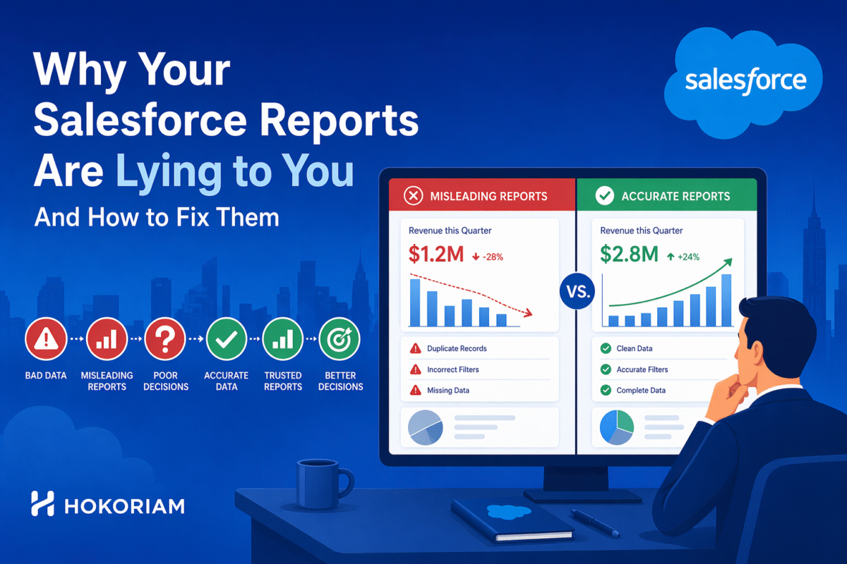
Every Salesforce implementation produces reports. What most of them do not produce is accurate insight. The problem is rarely the reporting tool. It is the data it reports on, the filters that shape what it includes, and the structural limitations of standard report types that most users never encounter until a number they trusted turns out to be wrong.
The Six Mistakes That Make Salesforce Reports Unreliable
1. Date filters that exclude records you don’t know you’re missing
A sales pipeline report filtered by “Close Date this month” looks complete. It misses every opportunity without a close date and every one where the close date was not updated when the deal slipped. Most pipeline reports dramatically overstate active pipeline because close dates are not maintained with discipline.
Fix: Add a secondary condition: opportunities without close dates AND opportunities where close date is in the past but stage is not Closed Won or Closed Lost. Make those visible, not hidden.
2. Using the wrong report type for cross-object data
The report type determines which objects and fields are available. “Contacts with Accounts” shows contacts where an account exists. “Accounts with Contacts” shows all accounts including those without contacts, which are invisible in the first report type. Choosing the wrong report type silently omits data, and the report has no way to indicate what is missing.
Fix: Map out exactly which records should appear including those where the related object is empty before selecting a report type. Create custom report types in Setup when standard types don’t cover the combination you need.
3. Dashboard data that is hours or days out of date
Salesforce dashboards display data from the last time their reports ran. If no one has opened the reports, or if scheduled refresh is not configured, the dashboard can be showing yesterday’s numbers. Sales directors making morning pipeline decisions based on dashboards that have not refreshed since close of business the previous day are making decisions on stale data.
Fix: Enable dynamic dashboards that run on viewer’s data in real time. Set automated report scheduling for high-stakes dashboards. For true real-time needs, Lightning dashboards with data source refresh configured.
4. Metrics that measure activity instead of outcomes
A report showing 200 activities logged this week tells you your team is busy. It tells you nothing about whether that activity is moving deals forward. Activity metrics are the most commonly built and least actionable reports in any Salesforce org because they measure inputs, not results.
Fix: Pair every activity metric with an outcome metric. Activities logged alongside opportunities advanced to next stage. Calls made alongside demos booked. Build reports that show the conversion between inputs and outputs, not just the inputs.
5. Forecast reports that mix committed and pipeline amounts
Combining Commit, Best Case, and Pipeline forecast categories in a single pipeline report produces a number that means nothing specific. Sales leadership needs to see each category separately and needs those categories to be populated by reps with discipline, not defaulted to whatever stage the opportunity is at.
Fix: Build separate report columns or views for each forecast category. Train reps on the difference between forecast category and stage – they are independent fields. Use Collaborative Forecasting to give managers override visibility.
6. Reports shared with the wrong “Run As” setting
A dashboard set to run as a specific user shows that user’s data view to everyone who opens it. A VP-level user’s dashboard shows all data. When that same dashboard is viewed by a rep, they see the VP’s data including accounts they do not own and should not see. This is a data visibility problem disguised as a reporting problem.
Fix: Use dynamic dashboards that run as the logged-in user. Each viewer sees their own data. For management dashboards that genuinely need an aggregated view, set the running user to a role-appropriate user, not an admin.
How Hokoriam Builds Reports That Actually Drive Decisions
Our Reports & Dashboards Work
Built executive dashboards for a distribution client that replaced their weekly Excel reporting cycle real-time revenue by region, channel performance, and inventory movement, accessible on mobile for field leadership.
Designed a sales forecast reporting model that separated committed pipeline from speculative pipeline, giving the sales director a forecast number the board could actually use.
Created cross-object custom report types that surfaced data combinations standard Salesforce report types could not – including activity-to-outcome conversion tracking and multi-object customer lifecycle visibility.
Implemented dynamic dashboards for a 50-person sales team so every rep, manager, and director sees their correct data view from the same dashboard – no separate reports maintained per role.
We Build Salesforce Reports and Dashboards That Leaders Trust
With 100+ projects delivered, we know what makes Salesforce reporting break and how to build it so it doesn’t. If your team is questioning their report numbers, spending time in Excel because Salesforce doesn’t show what they need, or running dashboards they’re not sure they trust, that’s a problem we solve.